Who ARE we?
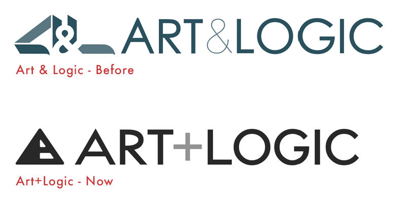
You may have noticed that we changed our logo.
We felt it was time to revise our design so it continues to represent our unique blend of art and logic while also connoting the kind of strong, solid, and innovative work we do. How to achieve this goal sparked some amazing conversations about who we are, what we do, and how we want to position ourselves in the market.
And so, the journey began…
The Logo Mark
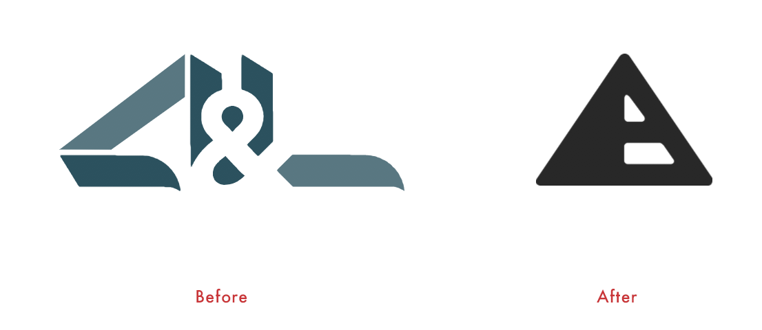
The shape incorporates the A in Art, the L in Logic, as well as the + joining the two words. It’s a solid mark, fashioned after the ancient pyramids which, in themselves, were no small feat to architect. This further symbolizes the level of skill and expertise we apply at Art+Logic.
The mark can also be seen as a road from the perspective of the traveler. At Art+Logic, we build lasting relationships with our clients. Software development isn’t a final destination, it’s a journey and we’re here to help you bring your ideas into the future, far beyond the visual horizon.
Lastly, the pyramid edges are rounded, representing a well-worn stone, much like a wishing rock or a Rune or some treasured object you can touch and hold in your hand.
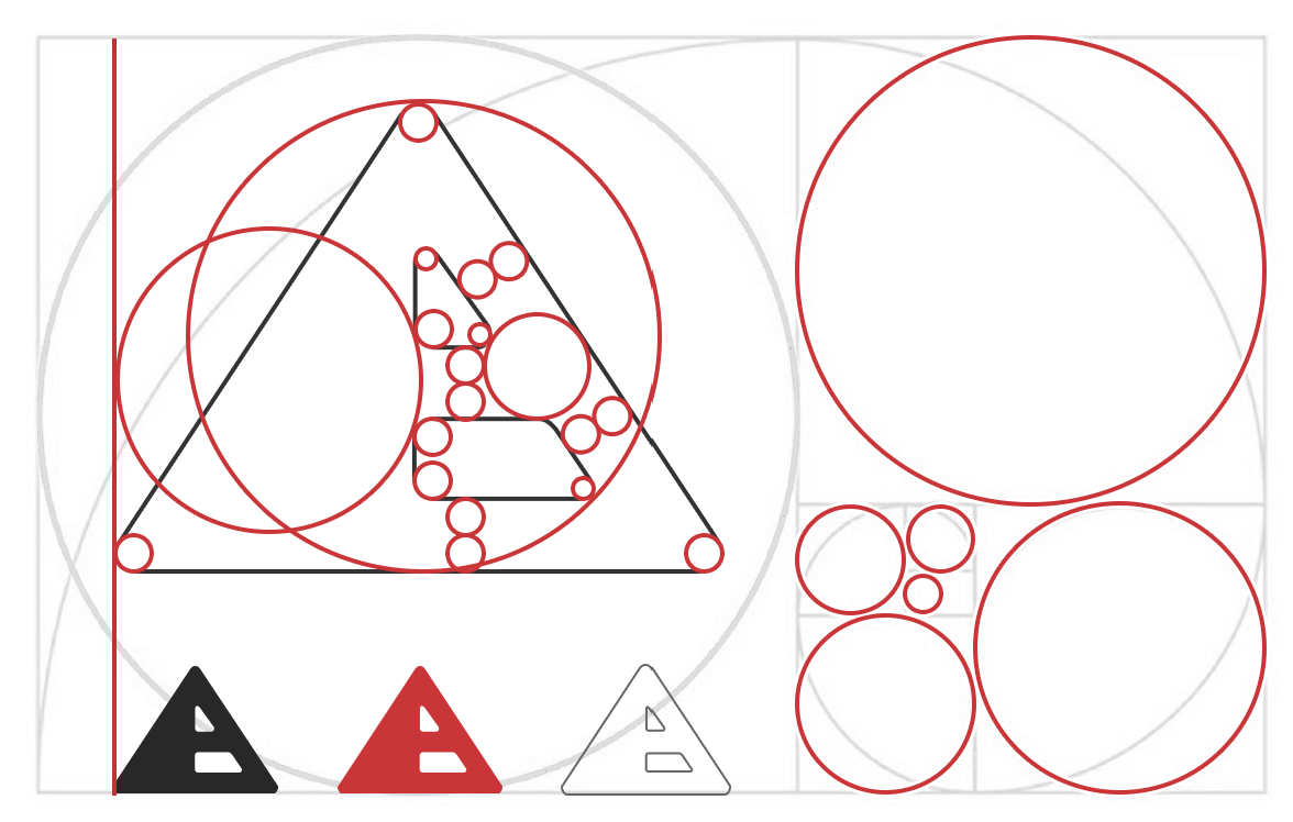
Golden Ratio
The logo mark was created using the Golden Ratio to ensure the design felt natural and proportionate to itself.
This was a meditative exercise in nudging and fine tuning. The results between using this method and not, is like night and day. It helps maintain a balance that would otherwise be rather difficult.
This was a meditative exercise in nudging and fine tuning. The results between using this method and not, is like night and day. It helps maintain a balance that would otherwise be rather difficult.
The golden ratio can be used to create more engaging and visually appealing logos for any business. Viewers are naturally drawn to the use of the golden ratio in a design, even if they aren’t sure why.
The Logo Text
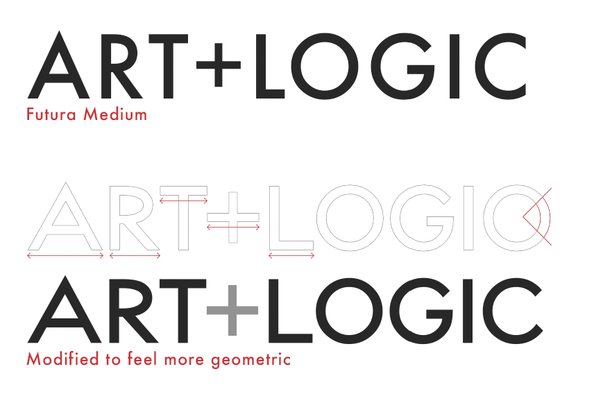
We started with Futura Medium, a geometric Bauhaus inspired font, as a base for the Art+Logic logo text. With a few minor adjustments, we were able to make the letters feel as if they belonged to the logo mark. The letters were stretched and angles modified to feel more proportionate with the mark.
& vs +
It’s a simple change, but it says a lot.
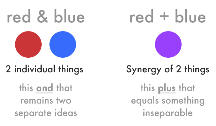
The ampersand was a key element in our past branding. We decided to try something different, something less detailed and easier on the eye. Not only is the plus visually cleaner, but & and + create two different ideas, as illustrated with red and blue. Yes, you would still read them both as “this and that” but the thought process is different. Art+Logic is not only a team of great artists and logicians, but it’s the combination of the two, and the effortless way we work together that allows us to do great things!
The ampersand was a key element in our past branding. We decided to try something different, something less detailed and easier on the eye. Not only is the plus visually cleaner, but & and + create two different ideas, as illustrated with red and blue. Yes, you would still read them both as “this and that” but the thought process is different. Art+Logic is not only a team of great artists and logicians, but it’s the combination of the two, and the effortless way we work together that allows us to do great things!
Social Icons
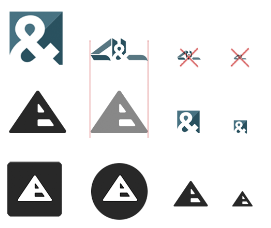
Our old “ribbon” logo didn’t scale well, at all.
We tried variations, but again, leaned heavily on the ampersand. It worked ok as an icon, but it broke from a cohesive brand and created a gap between our website and our social network presence. We wanted to be unified. And scaleable.
Our new mark is simple and bold enough that it not only scales well, but we also have room to free-float the icon in an open field. This is useful for social sites that create circle or inset icons.
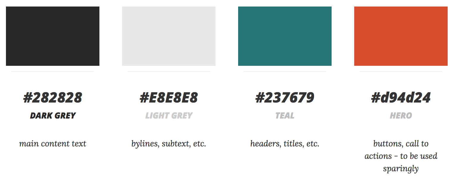
The Colors
Also driven by our findings on social platforms, we chose a monochromatic color palette of dark and light warm grey. Given the many shades of blue commonly used on social networks, and the sea of colored banners and graphics, this is a strong way to make our icon stand out. Of course, we still have our hero colors for CTA and accents, but our logo remains monocrhomatic.
And, go!
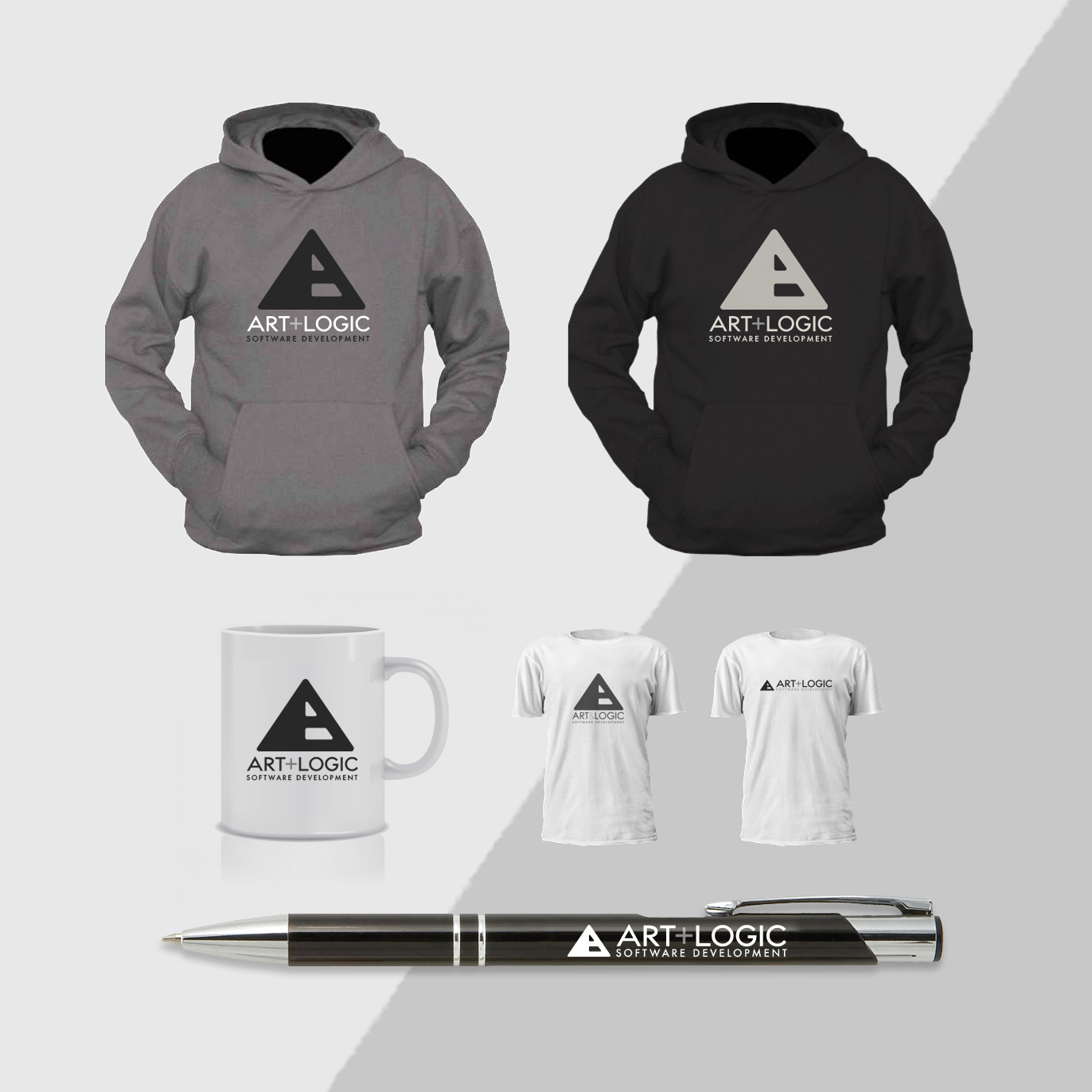
We’ve rolled out the new brand on our internal applications, Facebook, Twitter, Google+, LinkedIn, as well as stationery and our company t-shirts.
Already, it feels like a stronger presence. Not only aesthetically, but technically, as well.
Our new brand represents who we are, what we do and most importantly, what Art+Logic can do for you!
Already, it feels like a stronger presence. Not only aesthetically, but technically, as well.
Our new brand represents who we are, what we do and most importantly, what Art+Logic can do for you!