Branding and logo guide
the mark

The A+L “Pyramid” Mark
The story behind the mark
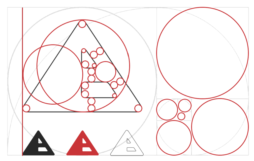
Just like the great pyramids in Egypt, our mark represents a seemingly simple design, yet a complex underlying structure requiring vast amounts of technical expertise and engineering. It’s solid and bold. It’s a road fading into the horizon, representing forward motion and the long-term relationship we build with our clients while on this journey. The left side is the finished product, whereas the right side is a peek under the hood: the scaffolding, the inner workings, the multi-tiered solutions. The right side also shows a hint of the A in Art, the L in Logic, and the + which joins the two, creating a synergy of elements, greater than just Art and Logic.
The logo can also be overlayed on photo backgrounds as you can see at the top of this page.

Light

Dark
used on light backgrounds
variations
Vertical


Horizontal


icons
Social icons
Typically, social sites will resize the icon to fit their standard size, so pick a large size when uploading. Also, some sites display square icons, while others are round.
Use the dark background version for social sites so our pyramid appears as a beacon of light floating in a field of darkness.

Large
Appear on profile page along with the Art+Logic header.

Small
Displayed in comments, messages, lists, etc.

Small
Some sites display square icons
Basic icons
These have a transparent background and can be used for toolbar icons, dock icons, shortcuts, overlays, etc.

Large

Medium

Small
colors
Brand colors
Our brand is monochromatic for a number of reasons. One, it doesn’t conflict and clash with its surrounding environment. It allows us the flexibility to be playful with our content, ie: our blog, social site headers, illustrations, swag, etc. We’re not constricted to one color palette. The colors are not true black and white, but rather a warm dark grey and a slightly aged beige/grey, representing our 25+ years in the business.
We will continue using our hero colors, teal and red, however these colors should not appear in the logo, only in the surrounding content for attention-getting and call-out purposes.
A+L black
#181818
main content, outlines
Dark gray
#585858
bylines, backgrounds
Medium gray
#c8c8c8
bylines, accents
Light gray
#efefef
borders, backgrounds
A+L teal
#399294
headers, titles, etc.
A+L aqua
#51d1d2
backgrounds, accents
A+L red
#ca4821
hero color, accents
A+L teal lite
#C3D9DA
big header text
teal at 30% opacity
A+L aqua lite
#E5F6F6
big header text
aqua at 30% opacity
download
Download assets
Icon files, variations, formats, etc.