Those cool retro filters aren’t just for cameras and image editors anymore…
By coupling FilterEffects and a few simple image overlays, we’re able to achieve some pretty cool effects similar to those produced by camera apps, such as Instagram. Be warned, these filters are only supported by webkit browsers at this point, but it’s still an exciting glimpse into the future of CSS and a fun way to explore photo manipulation via code.
The Basic Styles
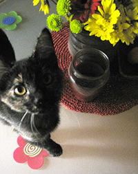
FilterEffects allows you to apply several effects, such as grayscale, sepia, brightness, contrast, invert, saturation, hue-rotation, etc – but for this post, let’s just pick a few to show the basic idea.
My sweet and amazing Quasi Kitty will be modeling these effects for us today.
Grayscale

.grayscale {-webkit-filter: grayscale(100%);}
The default value is 0%. This saturation can be adjusted ranging from 0% (original full color) to 100% (complete grayscale) The in-between values have some nice effects too.
Sepia

.sepia {-webkit-filter: sepia(100%);}
The default value is 0%, which applies zero sepia. Full sepia value is 100%. You can also use mid-range values.
Brightness
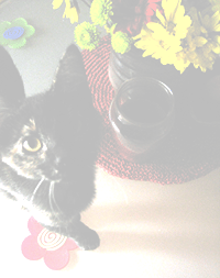
.brightness {-webkit-filter: brightness(20%);}
The default brightness is 0%. Values above 0 brighten the image, while negative values darken the image.
Contrast
![]()
.contrast {-webkit-filter: contrast(150%);}
This default contrast value is 100%, which is the original image. Increasing the value increases the contrast, while decreasing the value lessens the contrast.
Cool, right?
Now, here’s where it really gets fun 😉

You can experiment with overlaying textures, lens flares, gradients, etc and applying these same basic filters to those overlays. Here’s a lens flare image which will we’ll drop on top of the original image, with a 50% transparency.
.flare {
     opacity:.5;
     filter:alpha(opacity=50);
 }
If you throw both images (original and the overlay) in their own divs, you can layer them by z-indexing and absolute positioning.
<div>
   <div class="photo">
      <img src="quasi.png">
   </div>
   <div class="overlay">
      <img src="flare.png" class="flare">
   </div>
</div>

The CSS.
.photo {z-index: 1; position: absolute; }
.overlay {z-index: 2; position: absolute;}
Here’s an example of mixing the basic styles with a transparent overlay.
And why stop there?

You can layer as many divs as you want to really achieve that old, vintage, color blasted, lens flared Instagram flavor. Also, try applying the basic styles to the overlays, such as contrast, brightness, etc.
FilterEffects also provides blur, saturate and hue-rotate, which may not be fully supported yet, but again, fun to play with.
Say cheese! snap
