A new iOS release has been announced, and before the echo of the carefully selected exit music has stopped reverberating in Moscone West the pundits have already tweeted, posted and blogged their opinions. This is the sport of being an Apple fan.
Has form outpaced functionality in this upgrade? Let’s look at what iOS 7 changes and how it might help you do what you need to do.
Game on.
The Look
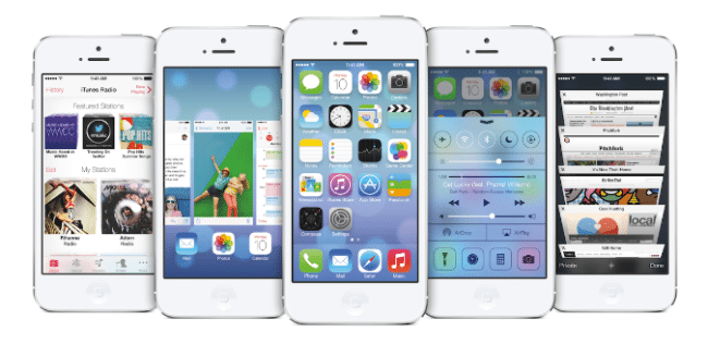
The first most obvious change is the abandonment of the glossy candy icons for flat replacements. iOS hasn’t entirely lost its z axis though. There is still illusion of depth between layers. Sheets can distort the views beneath. The background, however, gets even more depth queues. See the updates to the Weather app which will provide the illusion that you are looking outside a window as rain or snow falls behind the statistics.
I enjoy the look of some well done flat interfaces, (see Star Trek TNG’s LCARS or Ableton Live).What Apple has done must be too radical a change for me, and I may only grow fond of it in years to come like that one metal CD your friend played constantly in your sophomore year of college.
A serious criticism is that clickable things should look clickable. For decades this meant making a button in the GUI look like a physical button by giving it the 3D appearance of a button. Flat interfaces loose that information and must rely on other cues. Successful flat interfaces do this through simplicity and contrast. Yes, we are all becoming more and more familiar with graphical interaction as we use it year after year, and babies are getting addicted to iPads (lets see how they do with the flat buttons). But hand your iPad to your relatives over the age of 65 or 70 and see if they fumble trying to accomplish the most fundamental task like launching an app. Perhaps this is the true purpose of the new deep background. The postage stamp icons may differentiate from the background enough to stand out. Still, I fear we are abandoning novice users, and iOS 7 is not the only example of this.
The color palette has also radically changed. Apple’s iOS 7 website says they have limited the number of colors available. That’s fine, but why these colors? I don’t like it, even more-so than the flat icons. When I look at my iOS 6 desktop there are grays, blacks, and shadows. When there is color it is tastefully muted but rich; serious business evocative of neither kindergarten nor a Martha Stewart kitchen. My true gut impression of the primary colors seen in the examples is of Microsoft’s last few OS offerings. I freely admit to a bias here, but this is too bright.
And why? The best idea I can think of is that they have focused on harmonizing the new look for the white iOS devices. The website shows white devices, and the keynote slides used white devices. Perhaps this alternative to the black frames is trending up in sales, and it is one way for them to differentiate their hardware in a market where the competitors have almost caught up in many other ways.
The New Behavior
The notification center has been redesigned, and it has been joined by a “pull-up” on the bottom of the screen with controls for common settings. These should be productivity wins as shortening the path to accomplish common tasks can only make your day easier. Power users rejoice. The pull outs can lie hidden until discovered by accident or seen in use by someone else. Novice users will still trod through the Settings app for months to come.
Another potential shortcut is AirDrop. This lets you form ad hoc networks with local devices to share files. Clearly this is Apple’s necessary answer to Android’s “bump to share” feature. It remains to be seen if it will feel too clumsy with its “Would you like to share? Yes I’d like to share” dialog handshaking, potentially allowing Android to keep the upper hand here. In my experience when Apple is catching up, it sometimes isn’t able to surpass.
Your biggest bluetooth accessory to your iOS device could be your car. Several manufacturers have joined with Apple to provide in-car access to the device. Clearly a win for those who can afford the cars and are willing to buy from these manufacturers.
Perhaps most important is improved multi-tasking. With each release Apple has improved on this since its introduction. They claim another victory on that front. The task switching is much more intuitive than than holding the Home button, and choosing from the magic list that appears. The biggest drawback to multi-tasking—as any iOS developer knows, and a few users truly understand—is that it is very dependent on the app being a good citizen. Most users have experienced upgrading an app and find that their battery life drops severely. Or worse, their device slows to a crawl and even appears to hang. Bad developer! Pay attention to the memory warning notifications! Stop using the network constantly while you are in the background! I won’t name names. We’ll have to see what the SDK holds for us here.
Conclusion
A radical change to the look, and a few productivity enhancers. I suppose I must defer to Ives on the GUI, though I don’t like it at first glance. It has been busied up and now looks more like an Android or Windows device to me. I like the improvements to the homepage, minor though they may be. I’m willing to let Apple not reinvent the industry every year, so I’m satisfied.
But that Mac Pro…oh man, I wants me some.


