
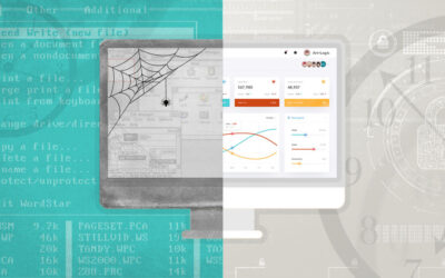
The above diagram shows two ways to place a grid on an HTML page. The <TABLE> version on the left is the old school way of managing layout. The web was positively littered with such code before widespread use of CSS (and browser manufacturer adoption of standards), which freed designers from use of tables or framesets for managing layout. The <DIV> version on the right is a sample of modern accepted practice, specifically in this example, using Bootstrap 3 styling.
You will find no one suggesting using tables for HTML layout (except when it comes to formatting HTML email. It’s ugly out there) today. Many a rant exists on the web exhorting all to separate presentation from structure, yet aren’t the two examples shockingly similar? Can the <DIV> version be that much better, when it looks like a one-for-one mapping of one element to another?
To answer the questions asked in the image, yes, the HTML on the left is bad layout and the sample on the right is OK. The reasons behind the answers come with an understanding of semantic HTML.
Semantic == Meaning
Semantic HTML is markup that enhances the meaning of the data it encapsulates. For example, the <HEAD> section collects the metadata for the document and the <TITLE> element within the head holds the title. These elements provide meaning to the structure of the document. Likewise, the <H*> elements for headings and the <P> element for paragraphs clearly mark the structure of the document and provide meaning to a human reader of the raw HTML or a machine wanting to process the document for presentation or analysis. HTML 5 is adding more structural elements, enhancing the semantics of a document: <article>, <section>, <nav>, and more.
Note, however, there is no indication, explictly or implicitly, in these structural element names suggesting how the data within those elements should be presented.
Contrast these elements with early HTML presentational elements: <B> for bold text, <I> for italics, and <FONT> for specifying font information. From a certain perspective you could say these element names are semantically correct. Their meaning is clear and precise – make this italic, make this bold – but this meaning is purely presentational and provides no human understanding to the text within. For example, <I> may instruct a browser to italicize the text, but <CITE> may do the same (if so styled) while offering the extra semantic meaning that the content is a citation. Machine processing is possible with citations, but what metaknowledge can be gleaned from a collection of italicized text?
It is generally excepted that <EM> (emphasized text) is rendered italicized and <STRONG> (strongly emphasized text) is rendered bold. Using EM and STRONG also frees a designer from explict use of italics and bold (they could be rendered in different colors, or sizes, for example). But do they really offer semantic meaning? What has been gained by exchanging <EM> for <I> ? Consider a user agent that is not a display browser – for example, a screen reader. Such a device can render the emphasized text by raising the pitch of the voice.
For further reading, the W3 HTML draft spec has an excelent section describing semantics in HTML in more detail.
Semantics of <TABLE>
According to W3:
The table element represents data with more than one dimension, in the form of a table…Tables have rows, columns, and cells given by their descendants. The rows and columns form a grid…Tables should not be used as layout aids.
When used for layout, designers are ignoring the semantics of a table (there being no data relationship between rows and columns in their table), relying solely on the default layout of tables to manage placement of elements.
We discussed above how presentational elements lacking semantics ( <I> , <B> , etc) are deprecated in favor of semantic elements which can be styled via CSS. The flip side is also true: abusing semantic elements like <table> for use of their presentational properties is equally discouraged. There are equal and better tools available through CSS for positioning and aligning elements of a page.
Need a stronger reason? Consider users of accessibility tools (again, screen readers) attempting to interpret content in tables where the rows and columns have no multi-dimensional relationship and the table child elements are used solely for layout.
DIV and SPAN
The <DIV> and <SPAN> elements are generic containers with no semantic meaning. All they do is represent their children. When used in conjunction with HTML global attributes ( id , class ), they can add semantic meaning to content where no HTML element exists to define the content –
Zip codes can be styled specially and machines can catalog and index the reference:
We find the economic status of families living in <span class="postal-code">12345</span> ...
By labeling the div as an Image Gallery, you immediately have a full understanding and expectation of the collection of images:
<div class="image-gallery">
   <img ...>
   <img ...>
   ...
</div>
When properly labeled with a class to identify its content, a div or span can offer semantic meaning to elements that would be otherwise absent.
Returning to the sample grids at the top of this article, we have divs classified as rows and columns. Their semantic meaning is clearly defined and CSS can handle the layout and related styling.
<div class="row">
   <div class="col-md-6">...</div>
   ...
</div>
Next
In a future blog post we will explore how to make the <DIV> version of grid layout even more semantically accurate by building on the tools Bootstrap (and its ilk) offer, without having to reinvent their wheels.
As an example to whet your appetite, imagine a web page that announces a monthly giveaway of 1st, 2nd and 3rd prizes, in a single row of three images of the prizes. Wouldn’t it be nice if we could write the HTML below, effectively inheriting or aliasing the Bootstrap class names, but giving them even more semantic meaning relative to their content:
<div class="prizes">
   <div class="firstplace">...</div>
   <div class="secondplace">...</div>
   <div class="thirdplace">...</div>
</div>
Well, you can! Stay tuned…