
Thailand, elephants and Micron pens
 After returning from a three month journey through Southeast Asia, I’ve been doodling elephants. Lots and lots of zentangle elephants. I attribute this to the set of Micron pens I bought in Thailand, and wonder if these fine writing instruments are even capable of drawing patternless, non-tropical animals. Testing that theory hardly appeals to me since I’m still in elephant mode. So instead, I decided to challenge myself in other ways by creating the world’s first purely HTML/CSS “hachyderm”.
See what I did there?
So, wait… what’s a Zentangle?
A zentangle is a wonderfully relaxing and meditative form of drawing: full of intricate patterns, flourishes, scribbles, dots and endless swirls. Every stroke is deliberate and made with purpose, with no real focus on the final outcome. And the best part? There are no erasers. There are no mistakes. Only opportunities to create new and unexpected patterns.
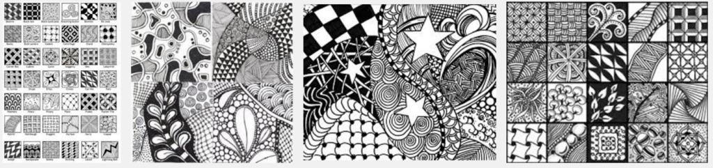
Zentangles – patterns upon patterns upon patterns.
And did I mention…?
It’s incredibly relaxing.
No doubt, there’s a direct connection between that and why zentangle coloring books are sweeping the nation’s magazine stands by storm.
So, let’s recreate those zentangle Feels in the digital realm, shall we?
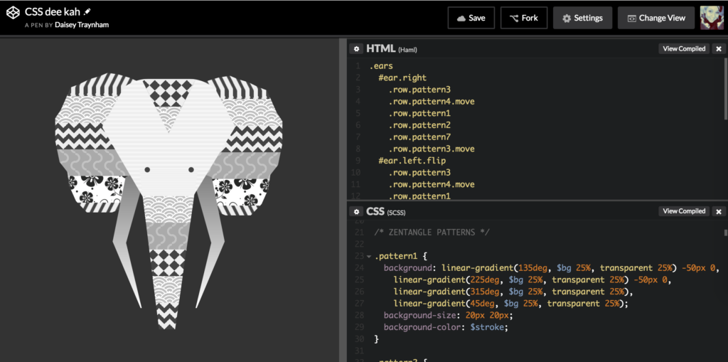
Codepen – Zentangle – a peek at the final outcome
CSS shapes, clipping paths
I was hugely inspired by Chris Pattle’s Simpsons in CSS and initially hoped to achieve that organic, hand illustrated outline style. He breaks the image into meticulously placed basic CSS shapes (especially for Bart’s hair!) then transforms, rotates, skews, sizes, borders and massages each little piece into place.
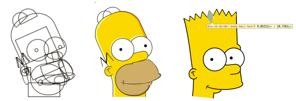 Kudos to the patience and dedication Pattle put into each one of the Simpson’s characters. I’d love to explore this technique for future experiments, but for the sake of this exercise, I kept it simple and used Clippy to generate some custom polygon clipping paths.
For instance, I created the basic head shape like so:

#head {
  border-radius: 35%;
  width: 250px; height: 300px;
  position: relative;
  left: 50%;
  margin-left: -125px;
  margin-top: -430px;
  -webkit-clip-path: polygon(49% 100%, 100% 30%, 81% 0, 20% 0, 0% 30%);
  clip-path: polygon(49% 100%, 100% 30%, 81% 0, 20% 0, 0% 30%); }
Then created a polygon for his nose, using :before and :after to place his eyes.

#nose {
  content: "";
  border-radius: 20%;
  width: 150px;
  height: 100px;
  -webkit-clip-path: polygon(15% 0, 89% 0, 60% 100%, 40% 100%);
  clip-path: polygon(15% 0, 89% 0, 60% 100%, 40% 100%);
  position: relative;
  left: 50%;
  margin-left: -78px;
  margin-top: -130px;
  &:before {
    content: "";
    background-color: $stroke;
    border-radius: 50%;
    width: 10px;
    height: 10px;
    position: absolute;
    left: 25%;
    top: 0%;
    margin-left: -5px;
    margin-top: -5px;
  }
  &:after {
    content: "";
    background-color: $stroke;
    border-radius: 50%;
    width: 10px;
    height: 10px;
    position: absolute;
    left: 80%;
    top: 0%;
    margin-left: -5px;
    margin-top: -5px;
  }
}
And on and on and on, all night til the break of dawn. – Erykah Badu
CSS background patterns
I grabbed several background patterns from Lea Verou’s CSS Patterns Gallery and tweaked variables to work within zentangle’s monochromatic palette. Here’s a class for a beautiful concentric circle background.

.pattern4 {
  background-color:silver;
  background-image:
    radial-gradient(circle at 100% 150%, silver 24%, white 25%, white 28%, silver 29%, silver 36%, white 36%, white 40%, transparent 40%, transparent),
    radial-gradient(circle at 0    150%, silver 24%, white 25%, white 28%, silver 29%, silver 36%, white 36%, white 40%, transparent 40%, transparent),
    radial-gradient(circle at 50%  100%, white 10%, silver 11%, silver 23%, white 24%, white 30%, silver 31%, silver 43%, white 44%, white 50%, silver 51%, silver 63%, white 64%, white 71%, transparent 71%, transparent),
    radial-gradient(circle at 100% 50%, white 5%, silver 6%, silver 15%, white 16%, white 20%, silver 21%, silver 30%, white 31%, white 35%, silver 36%, silver 45%, white 46%, white 49%, transparent 50%, transparent),
    radial-gradient(circle at 0    50%, white 5%, silver 6%, silver 15%, white 16%, white 20%, silver 21%, silver 30%, white 31%, white 35%, silver 36%, silver 45%, white 46%, white 49%, transparent 50%, transparent);
  background-size:40px 20px;
}
Of course, in true Zentangle fashion, we want to mix and match these patterns so I created a "row" class to define these chunks. We’ll apply pattern classes to each individual row.
.row {
 height:50px;
}
The patterned rows magically "stay within the lines" because they’re confined to their parent’s clipping paths.
Using Haml, cuz… why not?
This was my first time using Haml and it really sped things up when stacking and managing div layers. With such concise code, it was easy to follow the hierarchy and applied styles for each row (or in this case, each 50px tall pattern block)
#head.pattern5
#nose
  .row
  .row.pattern3.move
  .row.pattern2
  .row.pattern1.move
  .row.pattern4
  .row.pattern7
I can also apply the "move" class to individual rows for background animation, as well as a "flip" class to horizontally transform symmetrical elements, like ears and tusks.
The result
Overall, I’m psyched about the how this played out. The idea came together quickly and I’m inspired to explore various patterns and new ways to create more organic shapes.
Oh, and did I mention…?
It was incredibly relaxing.
As doodling always is.
Enjoy.
See it in action, follow this link to CodePen