
From the Art+Logic archive · written in 2013. The tools may have moved on; the thinking still holds.

A series of posts touching on elements of UI and Interaction Design that have come through my feed reader recently are really resonating with me to the point that I need to write about them. I’ve written here in the past about my distaste for skeumorphic interfaces. I’ve especially been thinking about this as I’m working on a personal music software project, and that industry was soaking its fingernails in the green goo of skeumorphism before the rest of the software development world had even heard the word. Consider products like Reason from Propellerheads:
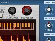

No expense was spared trying to make the interface as mimetic as possible, when you press the key that switches from the front view to the back view, they model the physics of the catenary curves of the dangling cables, animated as if you had rotated a rack of gear with great speed. This has always annoyed me, and it’s commonplace in the industry that effort is applied to perfectly simulate woodgrain cabinets and rotary knobs that look exactly like they had come off of a Fender amp from 1955. (I remember once estimating a project for a client who wanted a music player that replicated the behavior of a cassette player, including modeling the time needed to rewind. It actually would have been amusing to write that code, but….why?)
The folks at DesignVault (a revision management system targeted at designers) wrote a post last September where they talk about the being at the leading edge of what they call the “Honest Design Age,” and their arguments are compelling to me:
Designing honestly means recognizing that things you can do with screens and input devices can’t be done with physical objects, more importantly that we shouldn’t try copying them. It takes too much for granted. Can you imagine your pristine iPhone built into the body of an antique telephone handset? Is that beautiful design? (…) We borrow metaphors from physical objects but we refrain from copying. Copying inevitably introduces unwanted design problems, and the better the copy the bigger the problems. (…) Why create a small gem of a product and then weigh it down with design flourishes? The way you design your site should reflect your values, be consistent. Flat design is lean design.
Then earlier this week, they expanded on that visual approach by discussing a technique that they’ve been using that they call Progressive Reduction:
The idea behind Progressive Reduction is simple: Usability is a moving target. A user’s understanding of your application improves over time and your application’s interface should adapt to your user.
As designers, the longer we live with a product, the greater our bias shifts towards the professional user. Alternatively, blindly applying basic usability heuristics results in a bias towards new users. The mistake isn’t biasing your UI towards one type of user, it’s failing to realize that your user’s bias is changing.
How does one guide a new user from on-boarding, to low proficiency, to high proficiency? With progressive reduction, the UI adapts to the user’s proficiency.
Interesting stuff, clients are frequently insistent that projects be targeted toward the specific needs of novice users, but doing that ends up penalizing users who continue to use your systems because they only remain in that totally novice state for a brief period. We’ve made a different version of the ‘mimesis as interface’ mistake that flat design wants to get away from visually. In this case, instead of aping the visual look and feel of a physical object, we’ve fallen prey to the unstated assumption that just like a physical object, our software systems need to take a fixed form. While it would be either impossible or at the very least cost-prohibitive to build a piece of hardware whose interface changed over time to meet the usability needs of a particular user at a specific point on their mastery of that hardware, we’re making software. It’s SOFT.
This is an area where game developers have been already practicing these things for decades (how do you train a player enough on their first dropped quarter so that they want to put another quarter in? How do you alter things as the game progresses so that she’ll want to keep coming back to the arcade and spending more?) I thought that I was clever noticing that these kinds of principles from game development should be applicable to ‘regular’ application development, but as usual, Rands beat me to it:
the first time you play Portal, you have no idea how to play it. Like all games, the initial levels teach you the very basics: how to move, how to pick up an item, and how to use items to get things done. Yes, there is a heads up display indicating how to move, but it’s up to you to learn. Oh look, when I put the cube on the button, it opens the door… to where? The plaques at the beginning of each level seem important, but I don’t know why. Why do I feel something sinister is going down?
(…)
Yes, I’m going to compare Portal and Photoshop. Yes, they reside in two entirely different universes with entirely different motivations. This is about how these two universes should collide and that means what I’m really talking about is gamification. There’s a reason I didn’t mention this until paragraph 17 because there are a lot of folks who think gamification means pulling the worst aspects out of games and shoving them into an application. It’s not. Don’t think of gamification as anything other than clever strategies to motivate someone to learn so they can have fun being productive.
Convincing your manager or client to take the time and budget to implement these ideas is left as an exercise for the reader.