I’ve been interested in the issues surrounding how typography and layout can aid or impede developers working with source code. There’s an excellent book from ACM Press Human Factors and Typography for More Readable Programs (1990) by Baecker and Marcus that walks the reader through (in great detail) an iterative design process developing what the authors call ‘a visual C compiler’ to present C code in a format that maximizes a developer’s ability to read and understand large bodies of source code by appropriate use of typography and color. Considering that the book was published in 1990, I have to assume that many (most?) developers were still restricted to character-based monochrome development environments, and that the book was thus pretty much science fiction at the time (I started my career not long after this and remember being lectured by a greybeard of the time that color in computer displays was just a useless distraction). Certainly, few of its lessons have been folded into the tools that we work with. A few years later, Marcus published another book Graphic Design for Electronic Documents and User Interfaces (1992) that further develops and generalizes some of these principles for the modern bitmapped display systems of the time (Mac, OpenLook, NeXT, etc.). Flipping through it now reminds me that I should give it a re-read, and that a few years after its publication, an article by Marcus suggesting the development of systems supporting gender-specific UI layouts caused a lengthy kerfluffle in Communications of the ACM (I do remember his suggestion that women would find interfaces featuring rounded elements including circular windows to be more attractive and usable as something that particularly raised ire in readers).
Another book from that era that influenced my thinking about the environment in which we work is Knuth’s excellent Literate Programming (1992), especially the parts discussing his ‘Web’ (and later ‘CWEB’) system for Literate Programming, in which the primary artifact being created is discursive documentation that happens to have code embedded in it — the documentation is output for readability via his TeX system, and manipulated for compilation using a ‘weave’ program. TeX itself was written in this manner. 20 years later, and this is still science fiction, though.
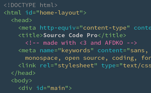
When I sat down to write this piece, I was excited about the announcement of Adobe’s new monospaced font Source Code Pro, which I’m switching all my terminals and editors over to after using the excellent Inconsolata font for the past few years. Source Code Pro seems to have some especially clean and distinguishable glyphs for the commonly confused characters:

The font is downloadable for free from here at Sourceforge. Also interesting is that the font itself is fully open source — you can also download all the source code used for the creation of Adobe’s entire Source Sans font family.
Now that I’ve thought about it in terms of the kinds of tools and environments we were promised 20 years ago, I’m less excited now. You can keep your flying cars. I want a more awesome way to build software.
Legacy Vulnerabilities AKA Software Senescence
Does your business still have an XT computer in the back office because it's running that one version of some database software that your business depends on? Yeah, we know there is. Most modern software doesn't work like that. If you aren't keeping your custom...


